- Published on
Visualization the Implicit Community within an Awesome List
Overview
Awesome lists are…. awesome. But could they be even more useful? What if instead of just a curated list you also got a view into a wider community?
NOTE 1: this is was also written up on Medium and is described from a slightly different perspective in these slides on Observable.
NOTE 2: Since writing this blog post, I’ve continued working on this idea and made a reusable template that you can use to start a new code repository, change a few lines in a configuration file, run two scripts, and get a whole new website with interactive visualizations to help you understand the code community documented in an Awesome List.
Table of Contents
What is an Awesome list?
An Awesome List is a community curated list of code projects within a specific domain, application, or use case. You can read more in the “Awesome Manifesto” on sindresorhus/awesome.
They are great places to first look for open source code projects that others have found highly use in your problem space, be it markdown editors, JavaScript data visualization, Jupyter notebook widgets, GraphQL, spatial analysis, robotics, or hundreds of other things. Other places people might discover code are word of mouth, google searches, trolling GitHub, seeing the packages used in other code, or having it recommended by a mentor or peer.
Searching for useful code projects is an investment of time. Anything that shortens that time, and enables a developer to reuse code instead of starting from scratch, offers big rewards in terms of time savings.
What Makes Awesome Lists so Successful?
This is mostly guesswork on my part, but I’d say the success of the “Awesome List” form is some combination of the following characteristics:
- Easy to start (Start a repository with a single README.md file)
- Easy to contribute to (Edit a single line in a markdown file)
- Fills a need (Every developer searches for new code tools)
- Builds a community (They have a very large number of contributors. People come back to check the list from time to time. People send links to it to others.)
What do Awesome Lists Not do Well?
As a curated list, they provide a signal of potential value. To be included on an Awesome List, someone has to say a project is “Awesome”.
However, there are a variety of other types of information that would useful to know when evaluating what code project to use or what project to contribute to that Awesome Lists don’t provide. They include:
- How popular each code project is?
- Is the rate this new code project is growing in popularity unusual relative to similar code projects in the past?
- What code projects are used by other code projects within the domain space as a dependency and therefore you might want to learn about?
- What code projects share dependencies and probably do related things?
- What code projects share contributors?
- What organizations own the most code projects in that domain/problem/solution space?
The interesting thing is, the information to get at all these questions exists, it just doesn’t exist in an easy to access to form most of the time.
All of the questions above can be answered with metadata extracted via GitHub’s or Gitlab’s API. Even the dependency information, which was hard to get at several years ago, is now extracted by code platforms are a service and available from their APIs.
Lawerence Livermore National Laboratory’s Software Catalog’s Explore Pages
A great example of harvesting this type of metadata using GitHub’s API and turning it into insightful visualizations is the explore section of Lawerence Livermore National Laboratory’s Software (LLNL) Catalog.
Wanting to understand similar relationships for subsurface geoscience code, I decided to adapt LLNL’s project such that instead of visualization Lawerence Livermore National Laboratory’s code catalog, it was visualizing the code curated in Software Underground’s Awesome-Open-Geoscience awesome list.
The Awesome-Open-Geoscience awesome list was started by myself and several other members of Software Underground, or SWUNG, in October of 2017. As of May 2021, it has 127 watchers, 720 stars, and 51 different contributors. It the most popular repository if you search “geoscience” on GitHub.com.
Adapting llnl.github.io to make open_geosciene_code_projects_viz wasn’t as easy as cloning it and re-running a script as the repository is less a tool and more a product. I had to remove lots of LLNL specific content, edit file paths, and replace bits of html, CSS, and JavaScript throughout the project. There’s still some work to get it to a place to where anyone else with a list of repositories they want to understand could clone the repository, change some lines in a configuration file, re-run a few scripts, and deploy as a GitHub pages page, but it’s getting there. Switching it from LLNL to SWUNG took me several days of work. Switching it for SWUNG to something else took me less than a day.
Ideally, it would great if it only take a couple hours of work to repopulate all the pages and visualizations for another Awesome list.
Visualizations that show the community connections across the repositories curated in an Awesome List
Beyond “curated list” and into “community level view”
The visualizations father down are static images, but the first one is an iframe embed. Most of the visualizations are interactive so best explored on the actual website. The data visualizations allow for many questions to answered that provide a community level view of the code projects curated on the Awesome list.
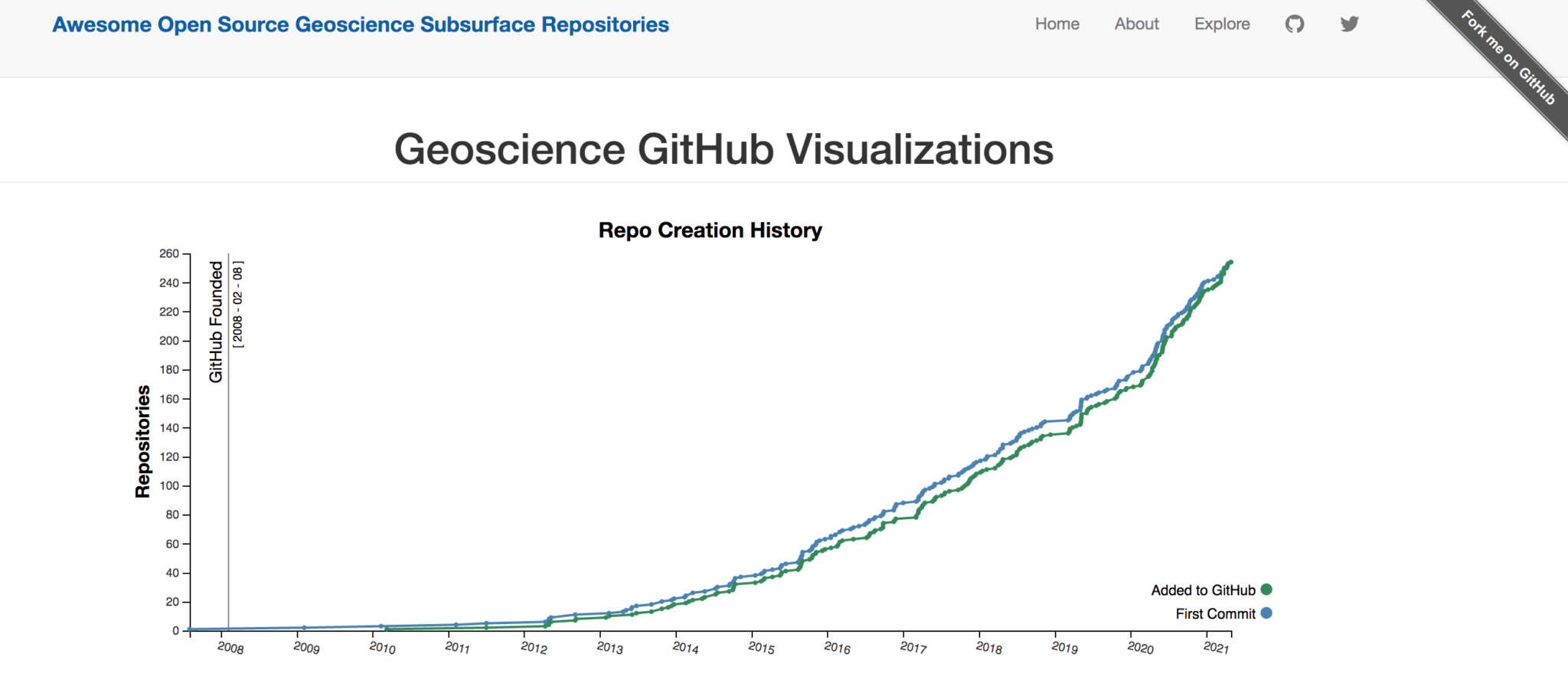 How often does a new code project in this space appear? How old are the older ones?
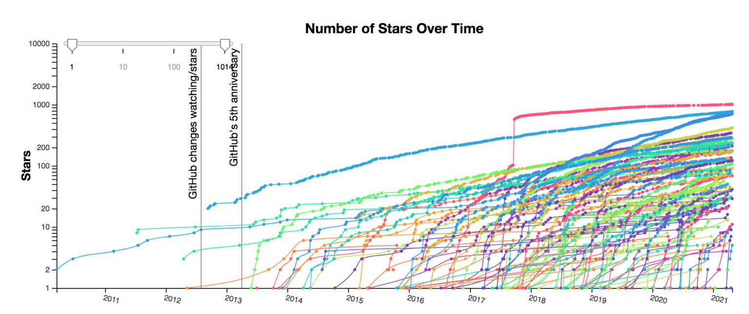 How fast are people starting this new project versus older projects? Has the number of new stars flatlined as people migrate to a new project?
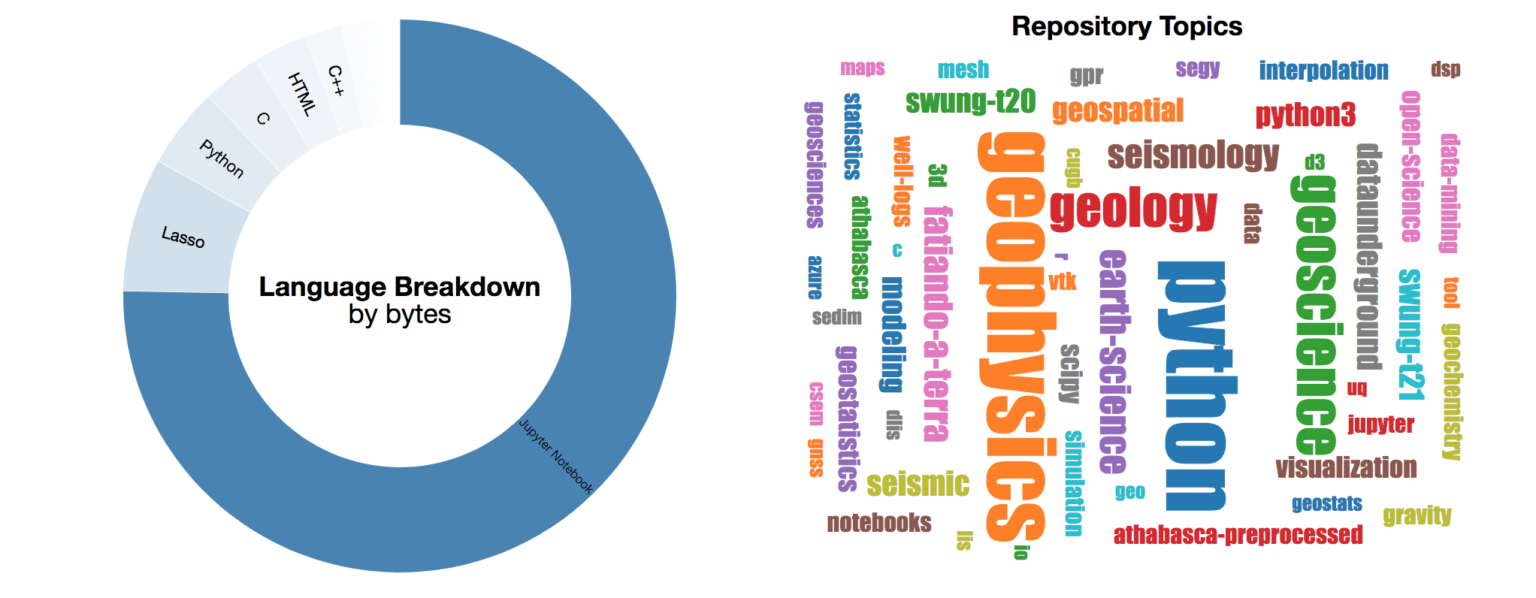 What are the most common languages within this Awesome list? What topics are the most common across all projects?
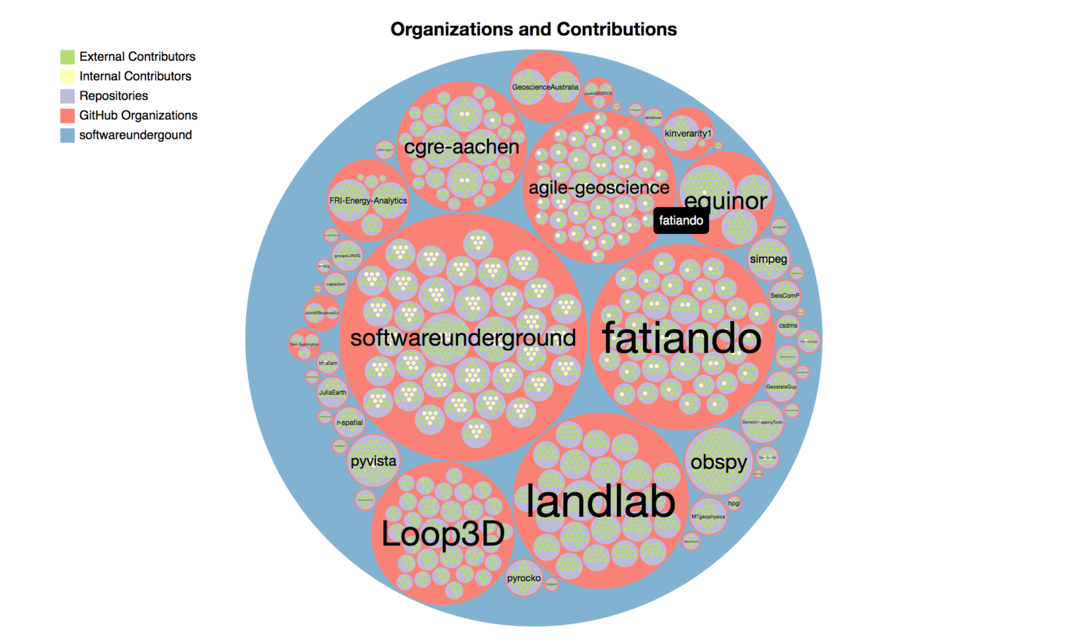 What organization or developer owns the most projects on the Awesome list? What projects only have contributions from the code owners vs. contributions from many external parties and therefore might be better places to submit a pull request?
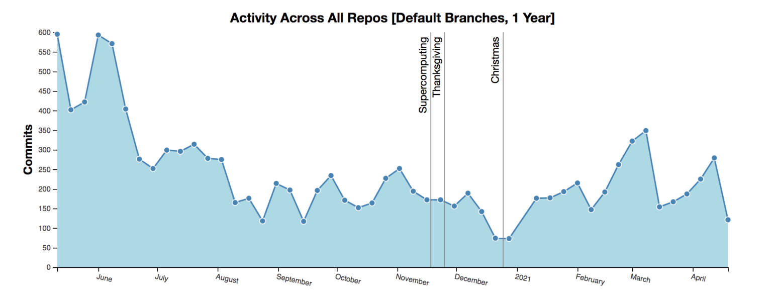 Has activity jumped around a conference or other event?
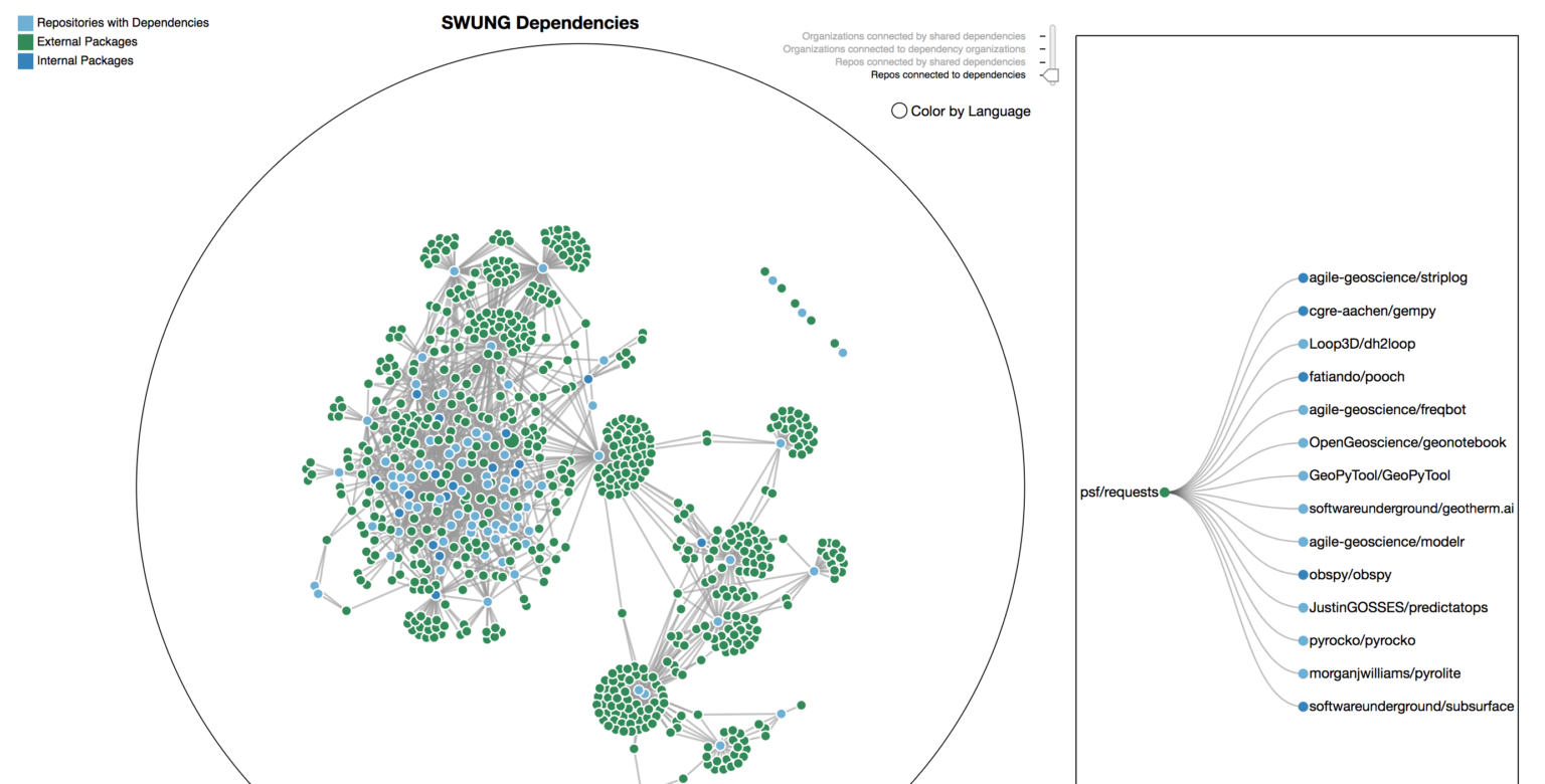 What projects on the Awesome list are used as a dependency by other projects on the Awesome list? Where to make contributions such that your code is reused by the highest number of projects? What projects are built entirely different than the norm? sWhat projects is it more likely you could jump in and contribute to as the dependencies are already very similar to your existing work?
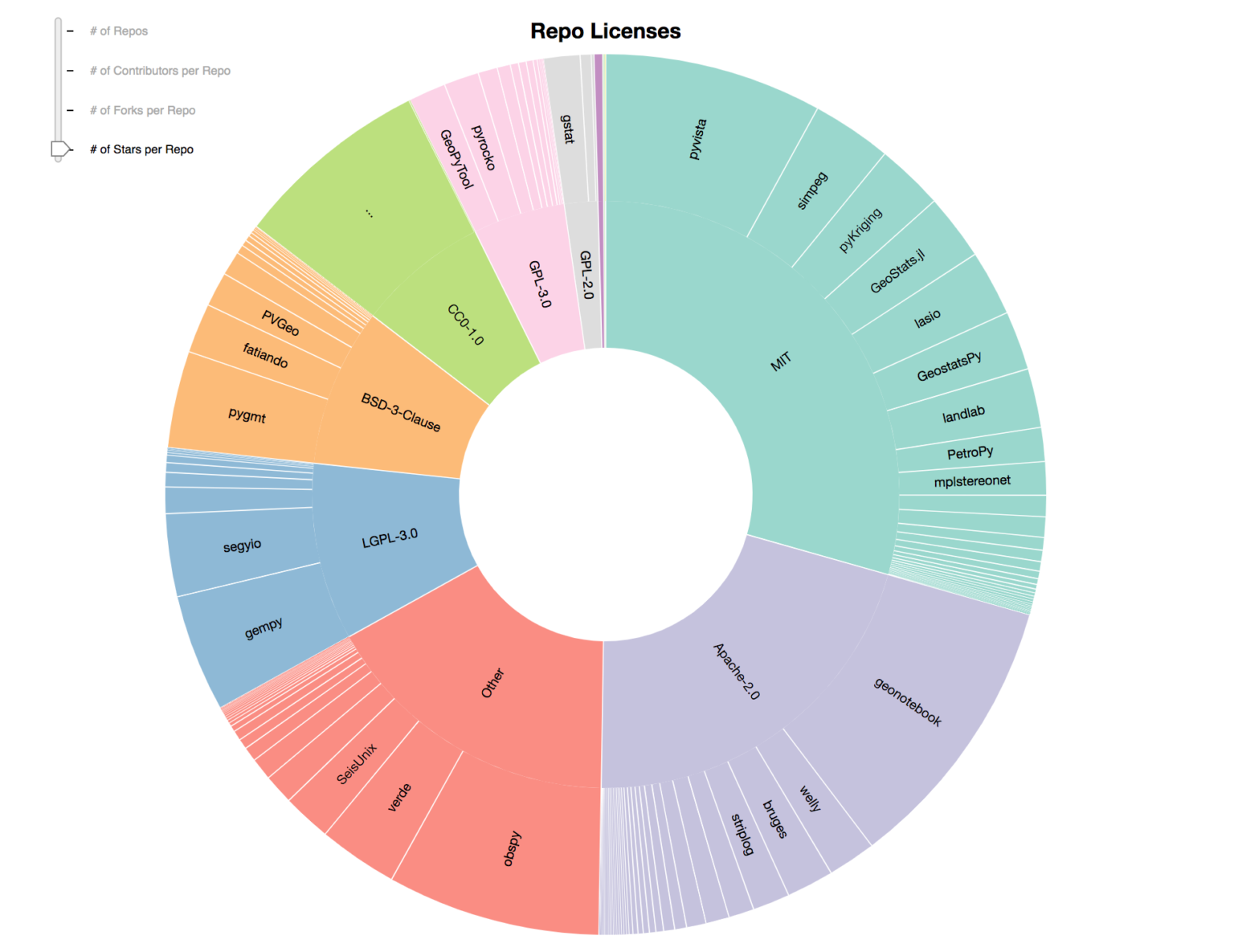 Picking a license can be hard. Is there a pattern in terms of what others in your community have gone with? Can you use this to help guide your choice?
Additional Questions that Could be Answered that Would “Nudge” Developers
As you might have already concluded from the questions that the visualizations help answer above, visualizing these type of information can nudge developers in ways the help direct development activity. This means visualizing the community of open source subsurface geoscience code has the potential to change how it develops in small ways. Thinking about it in this framing also helps suggest what future visualizations might have value.
Connection that could be made visible… What repositories share dependencies and therefore do somewhat similar stuff? …which could nudge developers to understand code as related groups and not hundreds of non-related entities
Connection that could be made visible… What code projects are used by projects I care about? …which could nudge developers to contribute to repositories that more people/projects depend on.
Connection that could be made visible… Do you and someone else contribute to the same repos? Is there a group of people that tend to contribute to the same repos?…which could nudge developers to reach out to specific people forming community.
The tech stack to get “Community Level View” from “Curated List”
So is this code at a place where anyone with an Awesome List, software catalog, or other type of list of repositories could easily re-run and deploy their own version?
Unfortunately, Not yet.
As noted above, converting the existing LLNL software catalog into open_geoscience_code_projects_visualization took a while. It was started during a hackathon but probably took 2–3 days of full time work. The current version is easier to adapt to another list but it would probably take at least a full day for someone unfamiliar with the code base. Additionally, repositories aren’t being pulled directly from the Awesome List programmatically, so any additions in the Awesome List would need to be added manually currently.
We can talk about possible futures, though.
In an ideal world, it would be easy and quick to take an existing Awesome Lists and create all these visualizations for the repositories categorized on that list. The visualizations would also stay up to date with the Awesome List.
Future Requirements:
- An Awesome List scrapper to pull out GitHub repository links. [done]
- A GitHub Actions script to do number 2 above and popular the input_list.json file of all the repositories to be visualized. This could be scheduled to check for updates on some interval. [updated: done]
- Documentation for how to easily add new or update existing visualizations in the explore section pages, such that changes can be easily integrated into already deployed forks. [No work done on this yet]
- Remove more of the list specific content in HTML and Markdown files and have it instead be populated programmatically from the key:value pairs in the _config.yml file in order to get the initial deployment down to a couple hours from several days. [updated: this is 90% complete in this new template repository]
More thoughts on this can be found in this markdown file.
How You Can Contribute
Since writing this blog post, I’ve made a reusable template repository at https://github.com/JustinGOSSES/awsome-list-visual-explorer-template. You can use it to start a new repository, change a few lines in a configuration file, run two scripts, and a whole new website with visualizations to help you understand the code community documented in an Awesome List will be created.
This is still in beta, so there is lots to contribute towards in terms of making it easy and obvious how to use.